I like to begin each quarter relearning the elements and principles of art. Then we do a project that I consider a playground to experiment with the elements and principles.
For 6th graders that playground is the Zendala project. I enjoy this project because it is rich with cultural significance but also dashed with a contemporary twist. The idea is they are creating a design that is symbolic of themselves. Every choice they make is a step towards personal expression. The first decision everyone makes is what type of balance they would like to use - radial, symmetrical, or asymmetrical. I don't hold back that radial is a challenge for me personally, since it requires such precision; it would drive me crazy. Although some do enjoy this challenge. We are all different and this simple fact should be celebrated in everything we do and make.
Comment?
Pages
▼
Personalized Self-Portraits
Doodling is not a mindless
act. It is meaningful. It is an escape from reality, it is inspired
by what we see, know, like, and experience.
In fact, many contemporary artists have adopted a doodle-ish approach to their artwork. It is a curious trend??? Gets me thinking - WHY?
8th graders collected images of patterns, textures,
lines, and symbols, even quotes, lyrics, and other words that have
meaning. All these things we combined to
create these personalized self-portraits with a doodle-ish twist.
I should mention, contemporary art is not the only focus here. 8th graders also
learned something from the great Albrecht Durer. He was a mathematician and artist credited
with “inventing” the grid method. So, we
pulled out our rulers and took lots of measurements, creating a grid that
guided us in the drawing these spectacular self-portraits. I found this a great way to warm up to observation drawing ... really helps the eyes and hands stay in sync.
Getting started
The first day of class, I wanted to find out what my students' thoughts were about ART. After going over the syllabus and procedures in the art room (essentially boring them to death). I gave everyone a post-it note. I prompted them to complete the sentence, "Art is...." I left the format open. They could write a sentence or two, write a poem, draw a picture, .... I was happy to learn that most felt art was a positive thing. Perhaps, I will ask the same question at the end of the quarter to see if the responses have changed or become more complex. We shall see.
 |
| A collection of thoughts ... not the best picture but you get the idea |
NEW, NEWS
Over the summer, something exciting happend. I interviewed for a middle school position and, well,.... I am now a MIDDLE SCHOOL ART TEACHER and I am thrilled!
Ugly Jugs
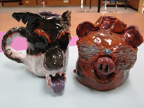
If you haven't noticed, lately, my classes have been focusing on Georgia artists. Ugly jugs or face jugs also fall under this umbrella. They are a southern tradition dating back to the Meader family and some would say it goes back even further to the time of slavery. Slaves would make them after the working day was done. Many speculate about why they are so ugly. My research reveals many reasons but the common thread is they are made to be frightening.
Fifth graders really impressed me.
 |
| big bad wolf and the little piggy |
 |
| okay... so the objective "ugly" was optional ... cute and quirky work too |
 |
| kitty cat friends |
Peter Loose Animals
Peter Loose is a folk artist here in Georgia. He was not always an artist. He once worked at a nature center ... come to think of it ... he may still, because he has a passion and love for nature. None-the-less, he is inspired by animals. Second graders surely noticed this as they viewed his paintings.
I happened to notice how Peter Looses' art had a lot in common with traditional Aboriginal art. So, we compared and contrasted these two distinct artists.
What do you you notice?
Enjoy!
Kimmy Cantrell Clay Faces
Last school year, I introduced 4th graders to the artwork of Kimmy Cantrell, a Georgia native. They enjoyed making these quirky clay faces so much that I brought it back this year. I experimented a little with the surface but the the objective was the same. Everyone made a face celebrating imperfection by using assymetrical balance, unexpected textures, and expressive features.
 |
| mostly mustache friends |
 |
| just a good pair |
 |
| bewildered |
 |
| "oooooooooooooooohhhhh..." |
 |
| great hair style |
 |
| asymmetry at its finest |
 |
| successfully imperfect and expressive |
 |
| 3 is a crowd |
 |
| One of these guys feels a little unsteady. Haha. Can you find him? |
Rousseau Jungle Landscapes
This is an oldie but goodie for
my 3rd graders. I find the
years that I decide to embark on this landscape adventure, 3rd
graders love it and have such pride in their completed artwork. This is important for the effectiveness of an
art lesson. I have certainly tried other
ways to teach depth but I always come back to this one. I love that Henri Rousseau is a well-known
Folk artist and I think it is pretty neat that he was never to a jungle yet he
painted jungles based on pictures. This
is a fact that most 3rd graders can relate to … not many have been
to a jungle.
The focus of the project was to
show depth using many techniques from dividing our space into foreground,
middle ground, and a background to overlapping and size variation. We even touched on how the appearance of colors
and details lessen with greater distances.
Another thing we noticed with Rousseau’s jungle landscapes was the vast
variety of plant life. We also saw the
rainbow of greens any how this variety makes the artwork much more interesting.


